

2.18.2008
Final Logo Layouts
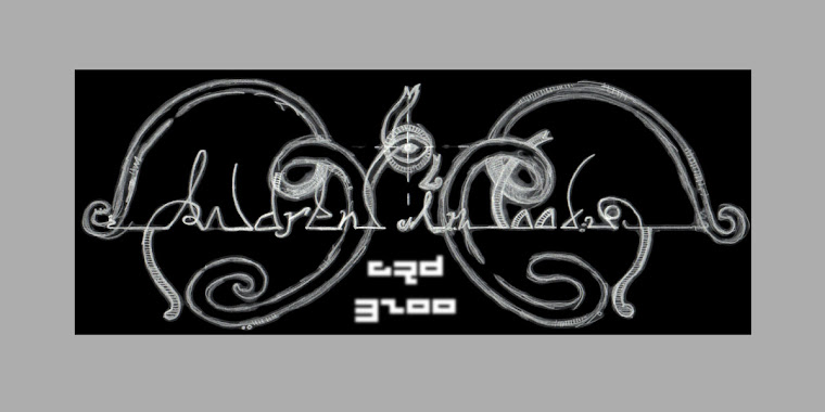
FINAL DRAFTS
Did some quick erasing on the swirls of the type to make it more readable. It's a bit messy but i plan to print it and trace by hand to make some changes in the "S" and a few other small areas. Experimented with adding in some color to the type & slightly changed the location of the subtitle. I erased the key-hole reference symbol that appeared next to the subtitle in my earlier designs. Lastly, I changed the subtitle name to "Exquisite Interior Collection" because I think that Collection references the fact that it is a showroom and makes it seem less like an outlet for mass production.
Vertical orientation + color palatte options

Diagonal orientation
2.17.2008
Company Item Applications
Business Card Cut-out design: the triad "tear" shape negative space of the key-head...by the way, if anyone knows what the top of a key is called, let me know. I've got a feeling it isn't just "key-head"
Match-box design: people tend to hold on to matches & use them frequently. would work especially well for chain-smokers. Not only would the receiver continue to use the business card/matchbox, but the possibility that they might pass the box to others is strong, giving the business card more exposure. Also, many people tend to collect things such as match boxes so this raises the possibility of the match-box business card sticking around even after all the matches are used.
Key-chain design: if i could figure out a way to manufacture a small, metal key, the receiver could hook it to their set of keys or put it on their key-rack at home, increasing the amount of times per day the receiver would look at it (every time they reached for their keys)...which could be 5, 10, 20 times a day...who knows
Playing-card design: a typical set of cards on one side, but the side which usually contains a repeating pattern (traditionally in red or blue) could contain the company logo/information. this would serve to increase the interest of the card and the probability of the receiver using the card again and again. unless they're an avid solitaire player, it is highly likely that others would be exposed to the cards as well.
Wood-cut design: I have a friend who works in a custom wood manufacturing company. they produce custom doors with extensive/precise cutting decorations. A machine in the warehouse is capable of custom cutting any piece of wood into any shape imaginable. I though i might be able to produce a series of business cards made of thin strips of wood. The only problem might be the application of any text/information b/c the machine may not have to capability to do such small-scale carving. Some sort of lino-cut or stamp might be a possibility?
Those are my initial ideas I just came up with. Will update as the process runs along.
By the way, if you haven't checked out the business card design website which Jared posted on his blog, check it! There really are some great business card designs that are quite innovative/inspiring. The address is: http://inspiredology.com/business-cards/cool-business-cards/
VERY cool stuff, thanks jared
2.13.2008
Weird...

Okay, so I did this charcoal drawing last semester based on a daydream of my friend Layla (shown on my blog in my artwork section in sepia tone). I just happened to look at one section of the drawing which shows a figure ascending from a tile floor in front of a door with a keyhole, reaching for a rope and a key. The rope dangles down and ties to an upside-down chair, and the key is floating in the air, just out of grasp of the figure...At the beginning of my logo process, I experimented with furniture and chairs incorporated into a logo and went on to experiment with a key-hole design before finally setting in on my key logo design, which i am just about to grasp ahold of....kinda funny, wouldn't you say?
Digital Night No 2
So I was thinking that the color applied to my key logo in phtoshp/illstr looks....digital, unrefined, cartoonish... This is not the impression I want the logo to have and when Michelle told me this, it affirmed my stand that I am going to have to apply color/texture by other means. I'm working on an oil painting that might make for an interesting design and would be appropriate for pointing to the fact that there are many paintings that can be found in the showroom. The line etching is still in progress. I've prepared the copper plate but the printmaking lab was apparently all out of any sort of ground when I went tonight. If anyone knows where it might be, let me know...
Meanwhile, I am still pondering the company title description...Interior design showroom....This is what you might call every other one of the numerous showrooms that make up the ADAC building. I need something more specific, more intriguing & more directly connected with his showcase items...The fact that many (if not most) of the products in his showroom are made from rare wood from varying parts of the world, glass from far-away islands & other materials and locals makes me think i should include an adjective like "world", "worldy", "exclusive" (without using exclusive itself...too polarized), "sui generis" (just kidding)...etc. Also, I'm thinking that three words or less would be appropriate. Four is pushing it unless one word is three or four letters.
here's a list of some adjectives, words, ideas i'm thinking about:
Interior Decoration Showroom
Interior Decoration Collection
Exquisite Interior Collection
Distinctive
Specialty Production
World Interiors
Earthly
Sophisticated
Earthy
Exquisite
Fun with Key
I scanned in my inked logo drawing & did a really quick live-trace in illustrator to get an idea of what the drawing would look like in digital format. But...it's about 3 am so I thought, okay, I'm just going to have some quick fun and GO TO BED. I've accomplished a lot today so this is sort of my self-given received award...just some cartoony post-card ideas


2.12.2008
Final Logo Drawing
Step I
Step II
Step III
Hmmm.....I'm comparing this draft to the sketch from the "science of my logo" page and it seems that maybe i need to alter the key notch (the bottom right part of the key that looks like the lower-case "e" faces/mirrors a lower-case "g") a bit. It looks tighter in the previous sketch and I'm afraid I've drawn it too loose...i hope it's because it's late and my eyes are failing me, but i think not....
2.11.2008
Time to go digital


So, the lightbulb has begun to light up. Still a somewhat dim light, but it continues to brighten. After much research and sketching, I have diverted my energy toward developing my logo in digital format. Tomorrow, I am going to begin a line etch of the logo on a zinc plate using hardground to give the key a unique textured look. I may also try incorporating a typeface into the plate to see how it looks. Anyway, I would enjoy feedback. Thanks
The science of my logo design


So these are my thoughts at this point:
I pushed the limits of the key-hole idea but.. instead, I thought, a key would be a greater reference to Ernie's Showroom than would a key-hole. Using a key for the brand identity would allow me to incorporate many more things into my various productions for the company. For instance, I could use the key in conjunction with a key-hole if the circumstance arose where I thought it might be appropriate..Or I can also envision a delicate ribbon tied around the key-head, dangling down with some little tid-bit of information, such as an event title and date or something of the sort..
anyway, what I'm getting at is that the bottom image is my template for the key logo (not sure if it is going to be vertically or horizontally oriented)....i believe that the horizontal orientation may be easier in conjunction with my type, but the vertical orientation I find to be equally as interesting. I have secretly disguised the swirls at the top of the key as lower-case "e" and "g" wrapping around each other. I feel that if the key were layed out horizontally, though, that the same disguise could be initiated with the other end of the key that hangs down...the shape already references an E & G to some extent.
I realize that it isn't necessary for the E and G to even appear, but I think I think that i was blessed with two letters that work very well together and make for interesting patterns.
As far as the key-head section goes, I'm leaning more towards the few that give reference to foliage (leaf shape), as most of the products (especially furniture) from Ernie's showroom are made from natural elements from special locations around the world. Might be important to point to that interesting characteristic in the logo..or maybe not. What do you think?
I have really tried to think about the negative space that the design of the key-head makes. Since there are three categories of products (furniture, wall coverings & fabrics) that will need placement on many of my designs for the company, I'm thinking that a triad of shapes that the negative space creates could be extracted for usage with these three product categories. For instance, with the design that appears at the top of the fully-drawn key, the three cone shapes could be flipped 180 degrees and placed in conjunction with the company sub-title: Furniture Wall Coverings Fabrics.
Just a thought....
Other concerns: Key-head looking like a pretzel. COLOR incorporation. TYPE incorporation.
Subscribe to:
Posts (Atom)
