4.24.2008
4.22.2008
4.17.2008
4.16.2008
My portfolio box layout
In the process of working on the construction of my portfolio box with someone who owns wood-cutting equipment. Here's a rough layout i've constructed showing the box core and its top. The front section will hold my boards and the back section will contain some relevant book productions, products, etc. 
Posted by
Drewbius Maximus
0
comments
![]()
![]()
Any help?
I want to turn the background of this page to black b/c I'm tired of looking at this orange-brownish color, does anyone know how to do this without changing my layout or text?
Posted by
Drewbius Maximus
0
comments
![]()
![]()
Wall Pattern Brochure Display: Rough Drafts
My gloss optimizer ran out when I was going to print out my last draft of the evening the other night so the images of the constructed piece are one's I had to do completely by hand (including trimming the two different wall patterns with the same part of the pattern appearing on each...which turned out to be sortof a pain in the ass). Working on other types of brochure layouts for my final pieces...and I'm still tweeking this one, as I think each rectangular piece could contain a different wallpattern rather than having one entire pattern running across the whole length...also, if you didn't notice already, the images you are seeing is front and back of the same brochure (the jade on one side and the parchment color on the other). 

Posted by
Drewbius Maximus
0
comments
![]()
![]()
4.14.2008
GrD3000: Product Re-design. Thoughts and Layouts


So here's my design from 3000: Elmer's Rubber Cement, one showing my jar with color options I threw in to consider...not entirely sure if i want to stick with the blue from original elmers (definitely keeping the elmer's orange out of the mix)..The other shows my box design with bottle enclosed. It has perforated cuts so that the top box flap fits snugly over the jar top. the "e" logo on the top of the jar is a sticker that can be pealed off and applied elsewhere (logically...). Also shown is a close-up of my label in full. I'd appreciate any advise on color swatches, package construction, or logo strength before I make my final portfolio piece.
Just to let you know a little of my though process behind this design: Was tired of seeing the same old elmer's designs i've seen since a kid..and a logo (Elmer the Bull) that makes entirely no since and relates in no way to the product except that maybe little kids might associate the bottle with milk or may just like the big smiling animal?? anyway, when i look at the glue choices on the shelf, elmer's seems one of the least substantial choices of the bunch. I think it has a lot to do with the fact that they had us use Elmer's in elementary school to make horrible crafts and collage that was always messy and almost always fell apart. So when i see elmer's Rubber Cement, I immediately think...nah...not strong enough. So I decided to try and give it a more official, scientific look. This is achieved more in the way that I lay out the type on the label and utilize lots of white space. I wanted to keep the logo somewhere in between fun and scientific...precise...but I don't want to let those down who still want to walk into the store and be reminded of childhood as they stare down at their little jar of joy. Whereas the original design is a busy mix of blue and orange with a smiling bull, I want my design to be more formulaic, similar to a prescription bottle, easy on the eyes and give a greater sense of strength to the product itself. Anyway, that's sort of my thought process behind the whole thing.
Posted by
Drewbius Maximus
1 comments
![]()
![]()
4.13.2008
Rorsarch Inkblot Ad
Just testing some more concepts...this is a rough, rough draft of what could turn into an advertisement using the Rorsarch Inkblot psychoanalysis tests. I'll probably create the image using real ink on paper and scan it in and may even sketch the table to give the ad a uniform, black-white look.
Posted by
Drewbius Maximus
0
comments
![]()
![]()
4.11.2008
Company Doc's from class
Took some photographs of a few of the examples Stan brought in Thursday for the class. Thought it might help some people, so here you go.
Posted by
Drewbius Maximus
0
comments
![]()
![]()
PAPER collection . obsession MAYBE
So about once a week I have to organize my massive paper collection or I won't be able to find what I need when it's time to go through the stacks...took some photos during the organization process and began to realize I just might be addicted to paper...I assume there are worse addictions out there...
I use my television for holding my textured/rice papers..seems more useful this way.
My paper-scrap collection
The holy grail
Cardstock & Such
So I recently came across my old Lite Brite in the attic (still works!) and it contained all of my original Lite Brite paper with some already punched out to pattern. There were lots of blank one's left over from 1989 and the paper is nice and thick so I decided to make a book out of it. The hardcover is wrapped with the LiteBrite paper and I put all my different brightly colored cardstock sheets in to go along with the LiteBrite theme. It's also nice to have a sample book of all my colors to quickly flip through. If you have an old LiteBrite, you HAVE to check out the paper...So groovy, and the dot pattern for poking the lights through makes for attractive decoration.


Who could forget Counterintelligence Scarlett? haha

Posted by
Drewbius Maximus
0
comments
![]()
![]()
4.10.2008
4.09.2008
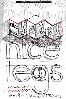
Brochure Concepts
Concept: Accordian cut-out
Essentially, I would imagine Escher would do something like this if he made artist books. That being said, don't worry if the sketches confuse you, it will make more since when you see it in three-dimensional form. Not going to even bother trying to explain with words....
Sketch 1
Sketch 2
Sketch 3
Posted by
Drewbius Maximus
0
comments
![]()
![]()


